
A spatial social platform for communicating across people, place, and time.
Digital communication is built for the present moment. Time Map asks what happens if you design for a different one, on purpose.
SCOPE
0 —> 1 Product
DURATION
60 days
ROLE
UX Research, UX/UI Design
Overview
Time Map is a spatial communication platform that lets people create memory capsules tied to a specific place and point in time. By combining an interactive map with a draggable timeline, users can intentionally rediscover past experiences or access messages scheduled for the future.
Product vision:
What if memories could be discovered instead of just stored?
My responsibilities
End-to-end: problem framing, user research, competitive positioning, product strategy, information architecture, interaction design, and a high-fidelity clickable prototype.
Outcome
A working prototype covering the full loop: discover, create, open, connect, and built around one core interaction: a bidirectional map + timeline.
Problem
Digital communication is optimized for immediacy, not for meaning that unfolds over time. That's not a gap I inferred from my own solution. It's a pattern that shows up consistently across the products people already use.
Products optimize for now
Messages are meant to be read immediately. Stories expire. Feeds rank recency over relevance, leaving no place for content tied to a specific past or future moment.
Memories are archived, not experienced
Photo libraries resurface content algorithmically, on the platform's schedule, not the user's. It happens to people, rather than being chosen.
Place is metadata, not interaction
Location is a tag on a post, not a way to navigate. No product asks: what happened here, at a different time?
Persona

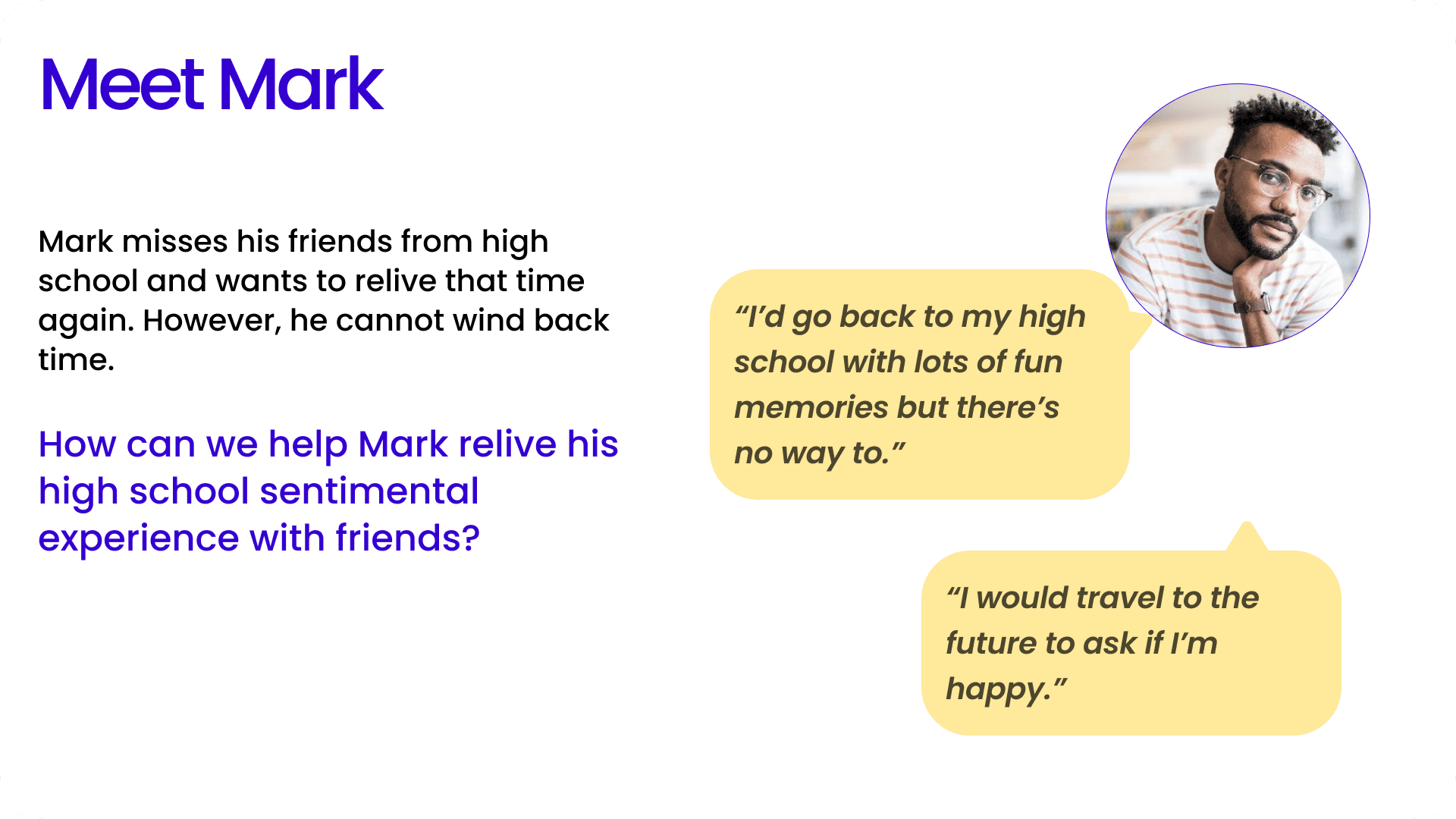
Design challenge:
How do you make time and place? Not just content, things people can deliberately navigate, rather than passively experience?
Success criteria
A first-time user creates and places a capsule with no instruction.
A user finds something meaningful near their location within seconds.
People schedule content for the future, not just the present.
Research
Research question
→
Interviews
→
Affinity mapping
→
Insights
→
Product decisions
RESEARCH QUESTION
Is "time travel" a real motivating frame, or just an appealing metaphor? What would make someone trust a stranger's app enough to leave something personal at a real GPS coordinate?
METHOD
Semi-structured 1:1 interviews, the right method for unprompted emotional recall ("what would you time travel to, and why?"), which needs open association rather than a forced-choice survey instrument.
SAMPLE AND RIGOR, STATED PLAINLY
Two interviews are shown here as illustrative primary research, not a validated finding, directional, not saturated. A production study would extend to 8–12 participants across more varied relationships to time before treating any decision as validated.
WHERE THE BIAS IS
Both quotes skew toward past-nostalgia over future-self framing, worth naming, since it could quietly bias the product toward "revisit" over "send forward" if left unchecked. A larger study should specifically recruit for future-oriented use cases.
Competitive analysis
Time Map has no direct competitors. Instead, it competes with a set of behavioral alternatives, each addressing only one part of the underlying user need.
Product
Primary job
Strength
Missing opportunity
Share experiences
Identity + social graph
No delayed delivery or intentional
rediscovery
Apple / Google Photos
Preserve memories
Personal archive
Algorithmically resurfaced, not
intentionally created for the future
FutureMe
Write to future self
Delayed communication
No spatial context or shared discovery
BeReal
Capture the present
Authenticity
No long-term memory or future interaction
Snapchat Memories
Save moments
Personal archive
Time exists, but place isn't central
Timehop
Rediscover past content
Nostalgia
No path to intentionally create future
experiences
Geocaching
Discover location content
Exploration
No emotional storytelling or temporal
dimension
Product Opportunity
Existing products treat people, place, and time as separate dimensions. Time Map treats all three as part of one interaction model, so communication is intentionally discovered, rather than immediately consumed.
This isn't "time travel" as a gimmick. It's intentional memory: giving people control over when and where something gets rediscovered, instead of leaving that to an algorithm or to chance.
Product
User Group
Location
Time Feature
✓
✗
Present
✓
Optional
Present
Google Photos
Self
Optional
Past
FutureMe
Self
✗
Future
Geocaching
Community
✓
Present
Time Map
Self, Friends, Public
✓
Past, Present, Future
No existing product spans all three dimensions across all three time horizons. That's the opportunity, not "Instagram plus FutureMe."
From Insight to Decision
Each research insight maps to one specific, testable design decision, not a general design principle.
People remember places as strongly as they remember time
→
Location becomes a primary interaction, not metadata
Delayed communication carries emotional weight for users
→
"When to open" is a mandatory, first-class step not a buried toggle
Public sharing requires clear privacy boundaries before people post anything personal
→
Three privacy tiers (Personal / Friends / Public), presented as a required step
People think about memories chronologically, not by exact date
→
A draggable timeline replaces a conventional date picker as the primary browsing model
Product Strategy
Each research insight maps to one specific, testable design decision, not a general design principle.
Value proposition
Leave something for a place and a time, not just a person.
Core interaction model
People + Place + Time
→
Memory Capsule
→
Discovery
→
Connection
North Star Metric
Capsules opened per active user per week: rewards the full loop (leave, discover, open), rather than one-sided posting or passive scrolling.
MVP scope
Map + timeline browsing, capsule creation (media, schedule, privacy), capsule opening (map + AR), and a minimal social layer (profile, comments, friend sharing). 3D-scan capsules and public discovery algorithms are deliberately out of scope for v1.
Design Process
Information architecture
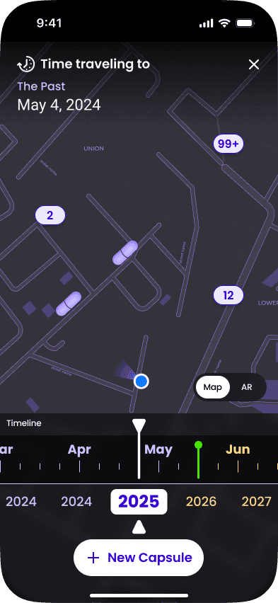
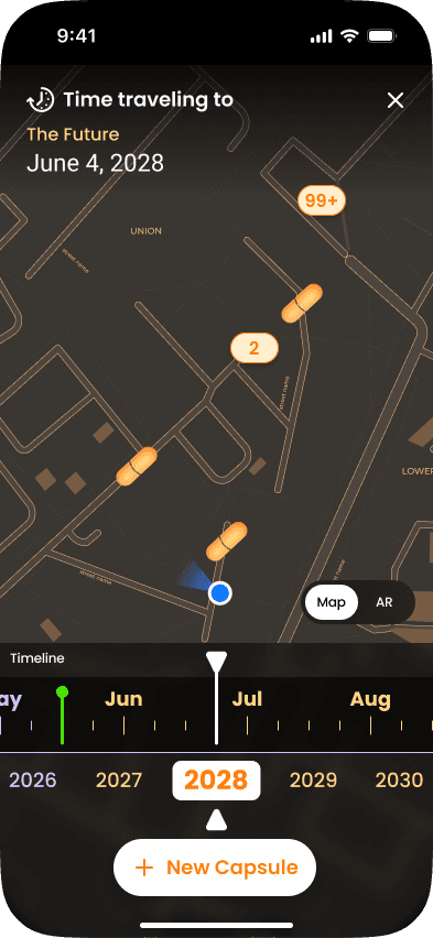
Two coordinate systems shown at once, space (map) and time (timeline scrubber) with a Map/AR toggle on the same location context. This replaces a conventional tab bar: past, present, and future are all reached by moving one scrubber, not by navigating to separate screens.
Why a timeline instead of a calendar?
Observation: people think about memories chronologically, not by exact date.
Decision: an interactive, draggable timeline instead of a traditional date picker.
Impact: lower cognitive effort, reinforcing the "time travel" mental model instead of feeling like form-filling.
Capsule creation flow
Sequenced concrete → abstract: media → message → open date → privacy → confirmation. The hardest decision — privacy and audience — comes after the user is already invested in the content, which should improve completion without hiding the choice.
Final Solution
Four flows built around one core interaction: the bidirectional map + timeline
01
Discover Through Time
User problem. Location-specific memories are undiscoverable once a feed moves on.
Design rationale. A draggable timeline paired with a live map lets users scrub between past and future years while staying anchored to one place.
Final UI. Map view with year selector and timeline scrubber; capsule density shown as count badges (e.g., "99+") near the user's pin.




02
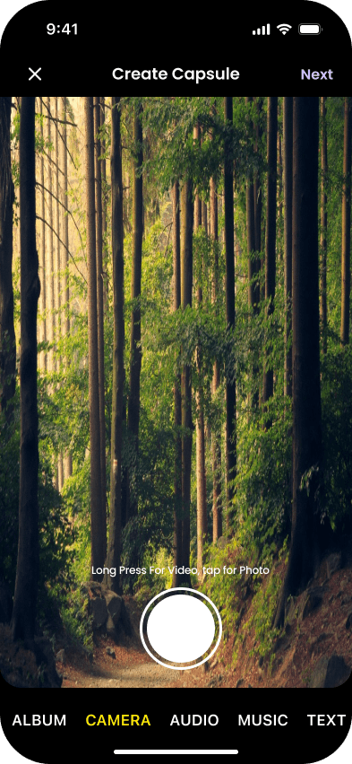
Create a Capsule
User problem. No product treats "send to the future" as equal to "post now."
Design rationale. Choosing the medium is its own step: image, video, audio, music, or text, because each is a different sensory way to share a memory, not just a file-type picker.
Final UI. Segmented progress bar; choose medium (image, video, audio recording, music, or text), then capture or upload content.



03
Edit Capsule
User problem. Delayed communication and public sharing both carry real consequences, so schedule and audience can't feel like buried settings.
Design rationale. Two dedicated parts within this step: first when to open (a required date, not an optional toggle), then who sees it (privacy tier plus friend sharing), each its own decision, not one combined form.
Final UI. Part 1: message + open date. Part 2: privacy (Personal / Friends / Public) and friend picker for shared capsules.


04
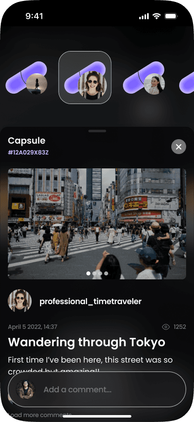
Open a Capsule
User problem. A memory needs context: who, when, where, to feel meaningful rather than just visible.
Design rationale. Media is shown first, authorship/date second, social layer (comments, views) last, mirroring how memory itself is processed.
Final UI. Full-bleed media viewer with capsule ID, creation date, and inline comment thread; AR mode overlays the same capsule in physical space.


05
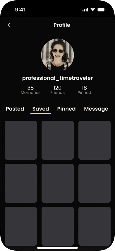
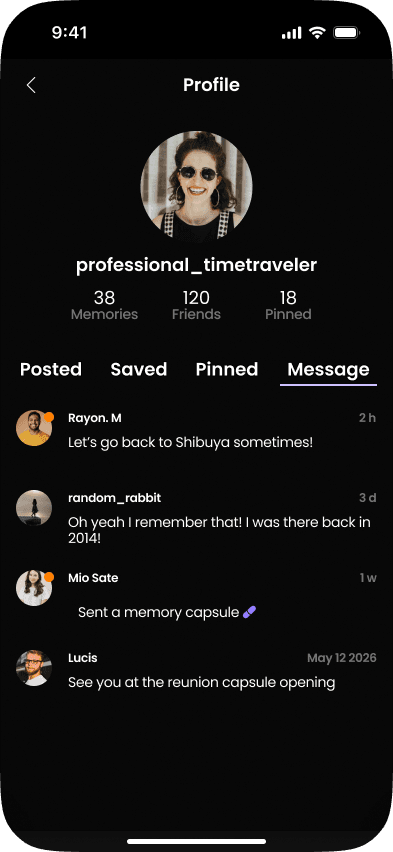
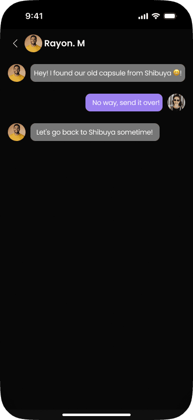
Connect With Others
User problem. Reconnecting with a dormant relationship carries high social friction as a cold message.
Design rationale. A shared capsule is a lower-friction entry point into contact than a direct message, connection happens through a memory, not before one.
Final UI. Tapping a capsule author opens their profile (memories, friends, pinned items); a "Received Capsules" surface holds anything scheduled for future delivery.


Clickable Prototype
Full interactive flow in Figma
Back to Portfolio Gallery